What a strange idea for the photo challenge. Except for the fact I’ve been throwing ideas around for a book cover.
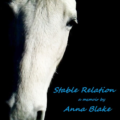
You see, I’ve been working on a manuscript for a book for the last 18 months. I am finishing the final edit right now. It has been a huge undertaking and as I near the end, I’m thinking about cover art. No kidding.

These are kind of like rough sketches, just ideas. Do you have an opinion?
Anna Blake, Infinity Farm.
WordPress Photo Challenge is a weekly prompt to share a photo- I enjoy twisting these macro prompts to share our micro life here on the Colorado prairie. My photos are taken with my phone, on my farm. No psych, definitely not high tech.
I prefer the second one!
Thanks!
Hands down I like the second photo and title better! The photo is softer and the “different kind of family farm” is clever.
Love,
Your opinionated friend, Andrea
Hehehe… thanks. I like opinions!
My vote is for the first photo!
Thank you!
Both are good but the first is more eye-catching for a book cover.
Thank you.
Anna, I’m sure you have a book and a half in you, and I’m thrilled for you. The photo on your mockup with the white pair in closeup is terrific. So is your title. The fonts don’t match the gravitas of the photo, though. Also I wonder if the title would work more in companion with the plurality of horses pictured if it were Stable Relations. All best with your project!
Thank you, Jan. I appreciate your opinion. I think you know, the publishing world is changing so fast, and I am such a newbie here. Thanks!
I was drawn to the first one. Love his ‘come hither’ facial expression!
Excellent, thank you!
I love them both. I think the one on the black background has kind of a questioning look. If you are wanting someone to open the book that is looking for answers, that would be a good one. The two grey horses together shows a softness and gentleness between these giant creatures. It depends on your purpose really. But both pictures are equally beautiful in their own way. I’d read it!
Great comment, thank you.
How exciting. I like number two. Congratulations on your manuscript. I can’t wait to read your memoir!
Thanks, Susan.
First photo for sure! Congratulations!!!!
Appreciate your opinion.
well, just because you asked – i like the top one. it is clean and clear with great contrast. i might change the type face. congratulations!!!
Noted and appreciated!
When I think of a relationship, it involves more than one. So. I’m voting for the picture showing two horses. No charge for my opinion.
Sent from my iPhone
>
Thanks, Coy. 😉
I like the white horse on black as well.
Thank you!
I am very glad to hear about a book! I love both photos, there is such sweetness to the second, but I think the first would stand out more as a book cover. Lined up on a shelf, the second could blur into its neighbors.
Good point, thanks.
AWESOME ANNA!!!!!!!!
Thanks, Tammy.
And oh, first one is my favorite…really captures the “Spirit”
Oh Tammy, it is the strength of family. That horse isn’t even distantly related- It’s Nube’!
I too vote for the first one.
Thanks.
I prefer the first one for the clarity and space for the title information. Perhaps a cream color for the typography. This would create an L shape leading the reader to open the book. The blue is distracting from the horse. The second image would be great for the flyleaf pages.
Thanks for the explanation, good idea.
I like the drama of the first photo and agree about perhaps a different font. I am a font fanatic!
Thanks. I am font disabled.
The bottom one is much more compelling by virtue of a more unusual photo, and also two subjects, which reinforces the title better. I would choose a different typeface, though.
Thank you.
I prefer the top one by far, fwiw. Direct interaction with horse and viewer means great appeal and simpler in design as well. It’s good.
If you ever need some pro editing (just little things) I’d be happy to help.
Barb Young
http://www.RainbowFarm.com
Quality horse boarding and retirement
on the Western Slope
http://www.BarbYoungPhotography.com
Equine and pet photography
Significant stock collection
Thanks, Barb.
The photos are both excellent. They have two different aspect ratios. What’s the size of the book? Will the photo wrap partly around the back? Think about the spine and the back cover as well as the front and keep them cohesive. If you’re doing self-published, print on demand, then the spine isn’t so important. But, if these will be in stores and on shelves, then pay close attention to how it reads from the shelf and in hand. All best on this project!
Thank you. Those are such good points, and right now, who knows about publishing. That industry seems to change by the week.
Good point about the spine – also consider what will catch the reviewer’s eye. I go for the more unusual photo of the second and the typeface of the first, but both pics are arresting. Can’t wait to read the book!
Thanks, Chris… I can’t wait for you to read it, too. That will mean it is finally done!
Absolutely, Love both. Hard choice.May be the top one because the black makes the writing pop and he’s more in your face like he’s communicating with you and looking direct. Hooray cant wait to read, something to look forward to.
Thanks, Nancy.
I like the second one best with the 2 horses
Thanks. I appreciate your opinion.
I like the second one.
Thank you.
Both pics are great – the lone horse is very striking. However, I would have to cast my vote for the other pic. Love the eyes. Also love the name of your book! Any idea when it will be published? Would make a wonderful Christmas gift. Diane Lacy
Sent from my iPad
Thanks Diane. And it would be a great Christmas gift–FOR ME TO BE FINISHED… but publishing is the slowest horse ever, I am sorry to say next year probably, but I will scream it from the barn roof as soon as I know.
The second one as relation implies several personae. Where will I be able to buy the book? 🙂
Thanks, Nadja. In my fantasy world, I would deliver the book to you in my world wide book tour. However in the real world, Amazon probably. Again, that decision might be up to others, as well as the cover design. Right now my only REAL answer is, “Who knows?” I’ll keep you posted.
In my fantasy world I’ll meet you personally and get hold of the book during my horsemen- and women-tour through the US. Who knows 🙂 Still, I’d love to be updated
Of course both choices are great. But the first one is a bit more eye catching. I’m looking forward to when it is published!
Thanks, Sharon. You have given me so much support, it means a lot to me.